Skip to content

[ 06 ] Visual identity · Wayfinding · Merchandise

Politecnico di Milano / 2025

University
Politecnico di Milano
Year
2025
Team
5 people
Duration
12 weeks

Verona UNESCO

Rebranding.

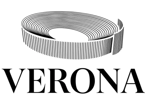
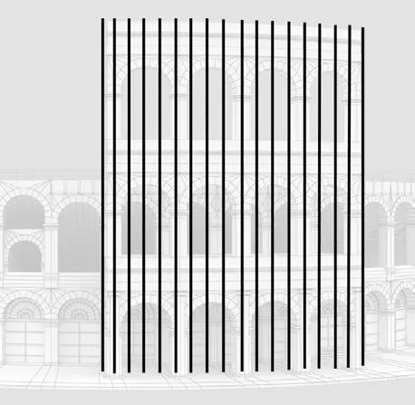
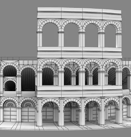
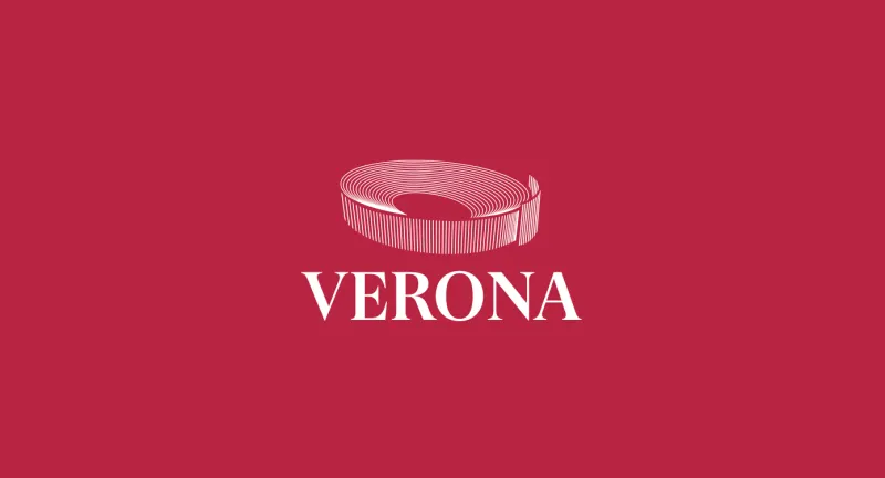
The Verona UNESCO mark, an abstracted Arena above the VERONA wordmark, on crimson red

The mark, on crimson

GT Super · #CC0B39

[ In one line ]

A visual identity for a UNESCO World Heritage Site, designed to convey Verona's historical, artistic, and cultural heritage both locally and internationally.

01

The brief

A city steeped in history. A brand waiting to be coherent.

Verona, nestled along the Adige River, is a labyrinth of medieval alleyways and palaces shaped by centuries. Inscribed as a UNESCO World Heritage Site in 2000, the city needed a visual identity system capable of communicating its essence, not as a museum piece, but as a living cultural presence.

The brief required a brand capable of speaking both locally and internationally, across physical and digital touchpoints, from billboards to apps.

02

The story

Why Verona is a UNESCO site.

Verona, founded in the 1st century BC, experienced periods of expansion in the 13th and 14th centuries under the Scaligeri family, then under the Venetian Republic from the 15th to 17th centuries. After Rome, it is Italy's second city for preserved Roman ruins: the Arena, the Roman Theatre, the Ponte Pietra, the Arco dei Gavi, the Leoni and Borsari gates. Beyond its Roman heritage, it bears witness to the Scaligeri's political power, the Venetian Republic's development, and the Austro-Hungarian fortifications. It is a city of culture, art, and layered time.
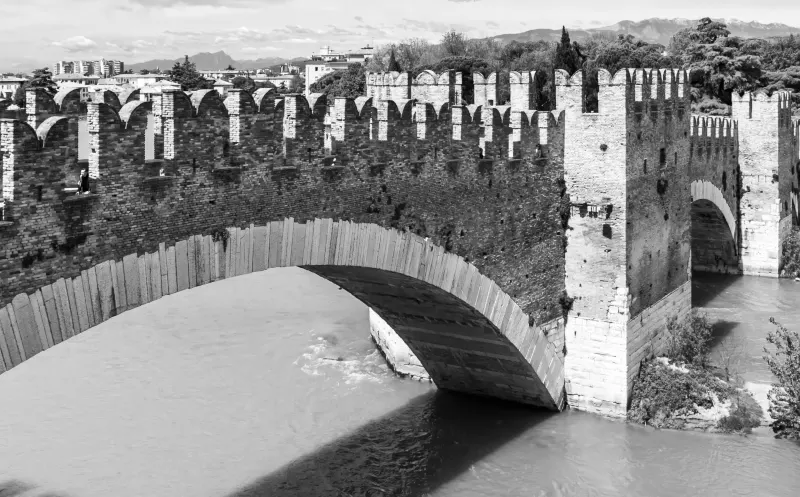
The Castelvecchio bridge over the Adige, in black and white
01 Castelvecchio and its bridge, over the Adige.
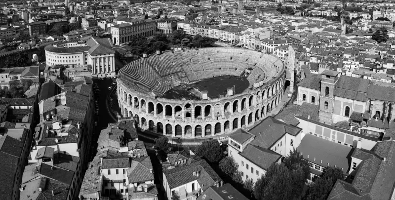
Aerial view of the Arena among Verona's rooftops, in black and white
02 The Arena, second only to Rome.
04

Typography and colour

Type and colour.

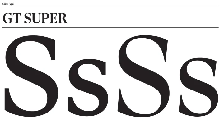
The typeface is GT Super, a serif chosen for its elegance and historical weight, capable of bridging Verona's Roman past and its contemporary cultural presence. The colour palette is built on three tones: white, black, and an intense crimson red. The red evokes the passion of the city and connects directly to the Roman style found in its monuments, while recalling the vibrancy of its markets, festivals, and traditions.

White#FFFFFF
Crimson#CC0B39
Black#000000
GT Super specimen: “SsSs” in regular and italic
09 GT Super, regular and italic.
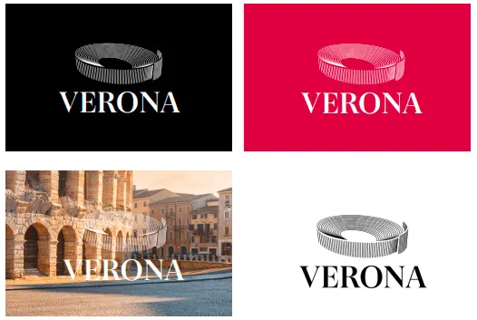
The mark on black, on crimson, on a photograph and on white
10 One mark, every background.
05

Applications

From urban billboards to postcards.

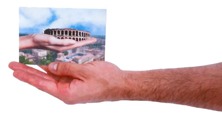
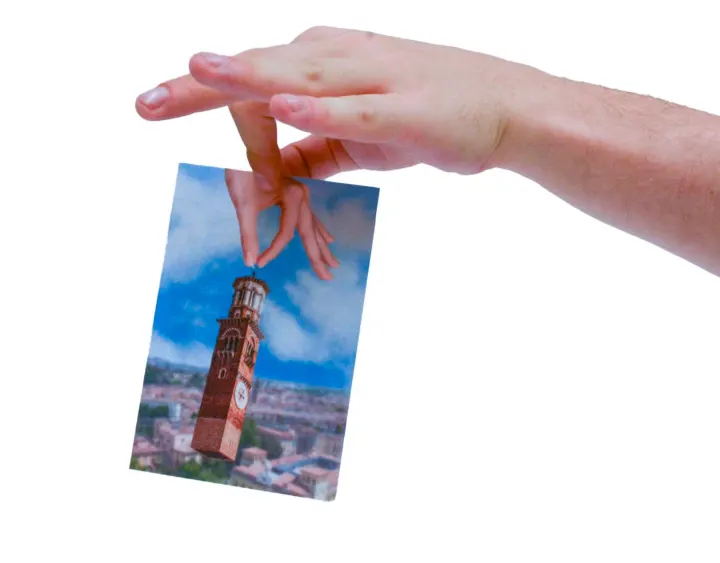
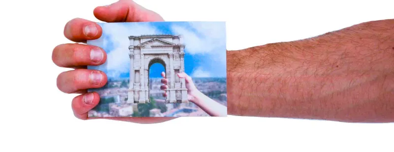
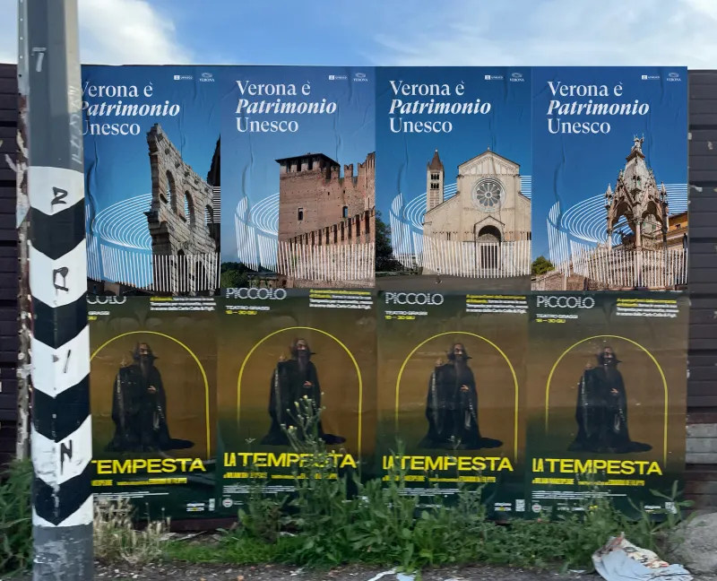
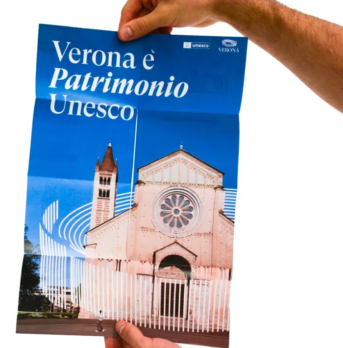
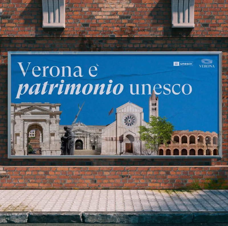
The identity system was applied across multiple formats, including billboards, posters, and a postcard series built around the concept of “Verona at your fingertips”, turning the city's landmarks into tangible objects to hold, share, and keep.

A “Verona è patrimonio UNESCO” billboard on a brick wall, showing the Basilica di San Zeno
11 On the street: “Verona è patrimonio Unesco”.
A hand holding a postcard of the Arena
12 Verona at your fingertips: the Arena.
A hand holding a postcard of the Torre dei Lamberti
13 The Torre dei Lamberti.
A hand holding a postcard of the Arco dei Gavi
14 The Arco dei Gavi.
A row of Verona UNESCO event posters pasted on a street hoarding
15 Event posters, in series.
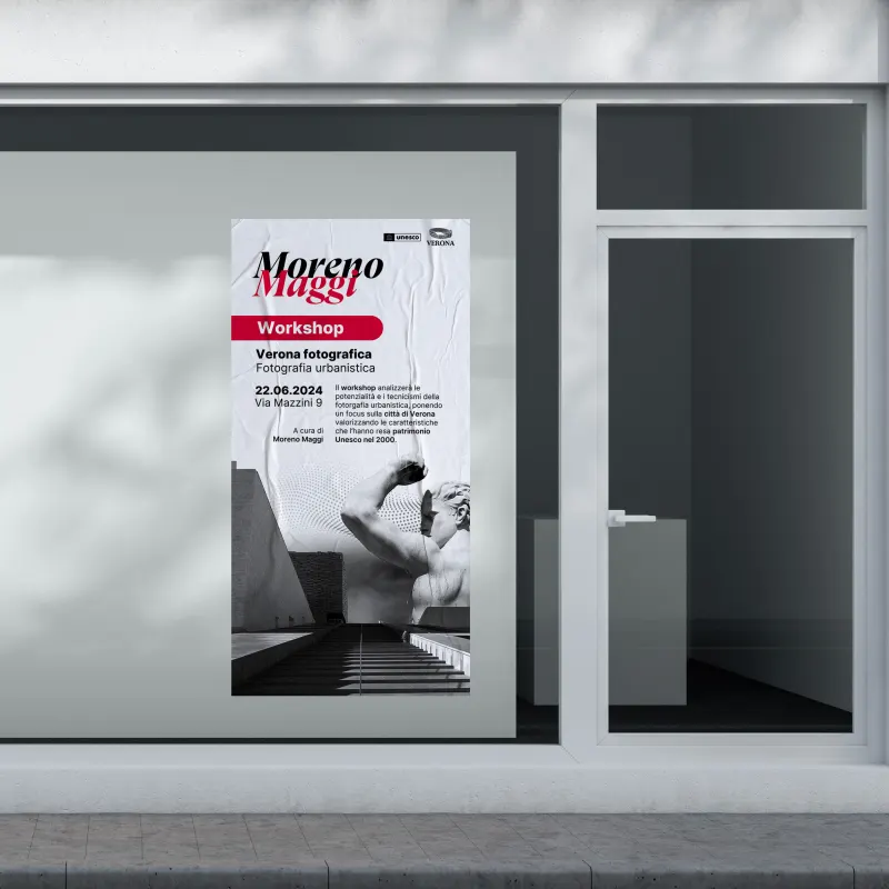
A workshop poster in a shop window
16 A poster in a shop window.
06

Merchandising

Institutional merch.

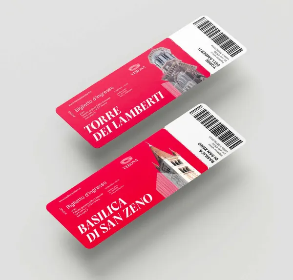
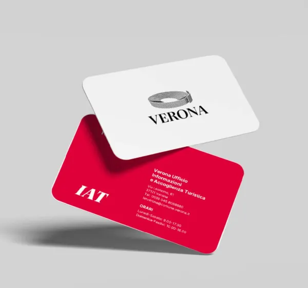
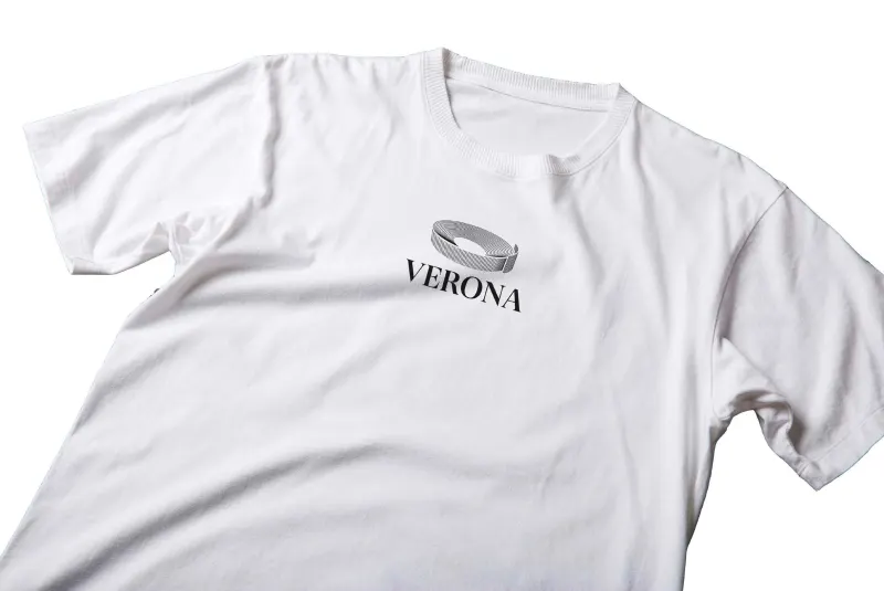
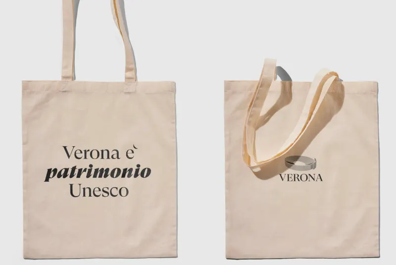
The institutional merchandise line extends the identity into everyday objects for both the organisation and its visitors. The system covers: headed paper, entrance tickets (19×6cm), business cards (5.5×8.5cm), staff badges, a brochure, a tote bag, and a t-shirt. Each object maintains the visual rigour of the brand system while adapting to its specific format and function.

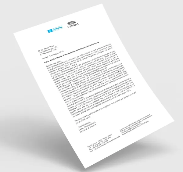
Letterhead, tickets, staff badge and business card

Verona UNESCO headed paper
17 Letterhead.
Two entrance tickets for the Torre dei Lamberti and the Basilica di San Zeno
18 Entrance tickets, 19×6cm.
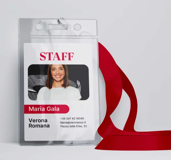
A staff badge on a red lanyard
19 Staff badge.
Business cards in white and crimson
20 Business cards, 5.5×8.5cm.

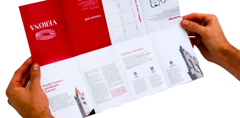
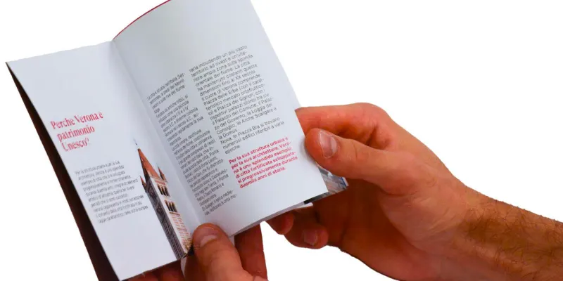
Brochure

The brochure unfolded into a poster of San Zeno, held up by two hands
21 Unfolded, it becomes a poster.
Hands opening the brochure to a map spread
22 The fold-out map.
Hands holding the brochure open on a text spread
23 Inside the brochure.

T-shirt and tote bag

A white t-shirt with the VERONA mark on the chest
24 T-shirt.
Two canvas tote bags: “Verona è patrimonio Unesco” and the VERONA mark
25 Tote bags.
07

Verona Amore

Verona Amore merch.

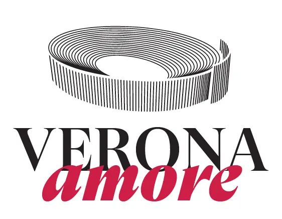
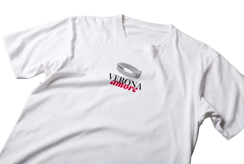
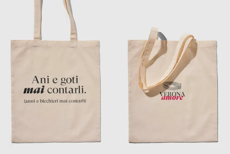
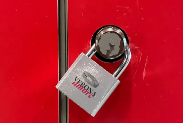
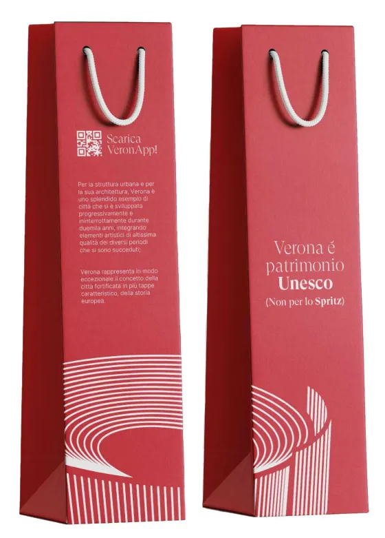
Verona is famous not only for its architectural and cultural heritage, but as the city of love. To enrich the merchandise offer and consolidate this dimension of Verona's identity, we developed a dedicated sub-brand: Verona Amore. Maintaining full visual coherence with the main identity, the line uses thematic elements that resonate with visitors from around the world. The collection includes a tote bag, t-shirt, wine bag, and love lock, each object connecting the UNESCO brand to the romantic narrative that defines Verona globally.

The Verona Amore mark: the Arena lines above VERONA, with “amore” in crimson script
26 The Verona Amore sub-brand.

T-shirt and tote bag

A white t-shirt with the Verona Amore mark
27 T-shirt.
Two tote bags: “Ani e goti mai contati” and the Verona Amore mark
28 Tote bags.

Lock and wine bag

A silver love lock engraved with Verona Amore, on a red door
29 The love lock.
Two crimson wine bags printed with the Arena lines
30 Wine bags.
08

Wayfinding

Navigation as a brand experience.

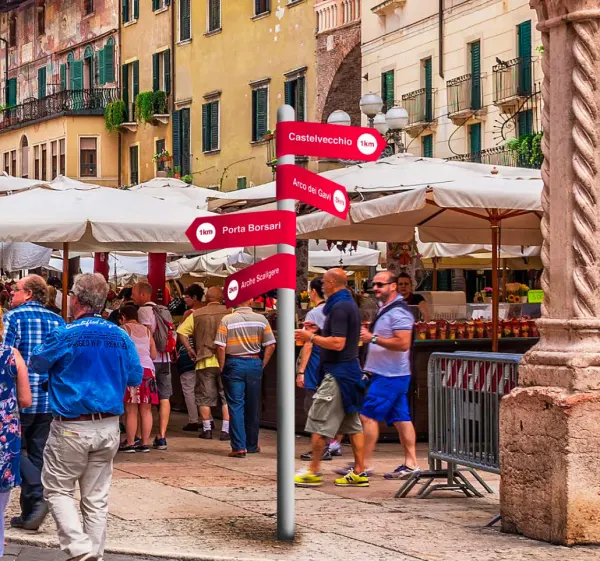
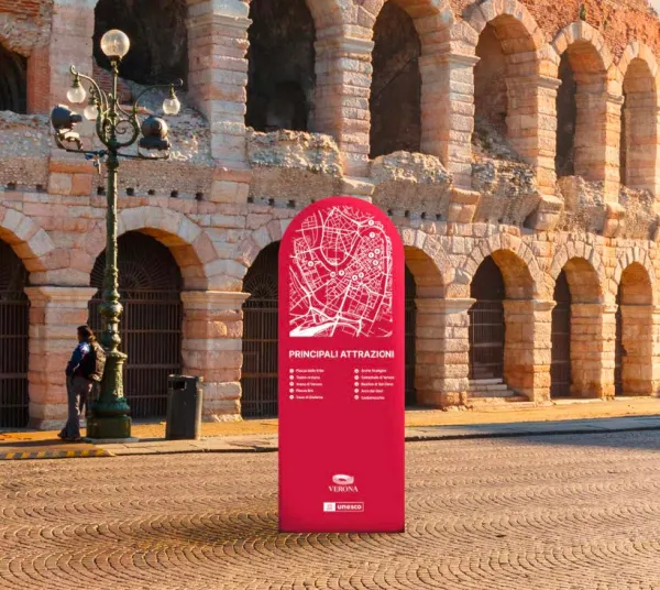
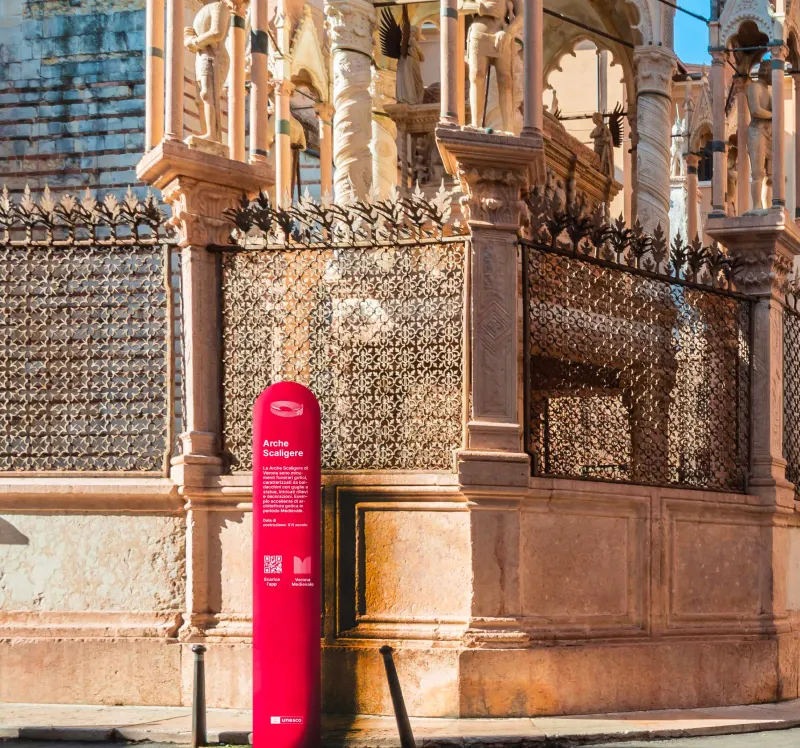
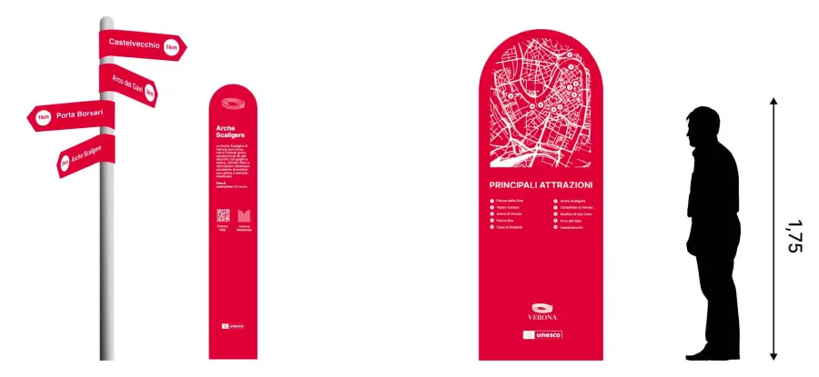
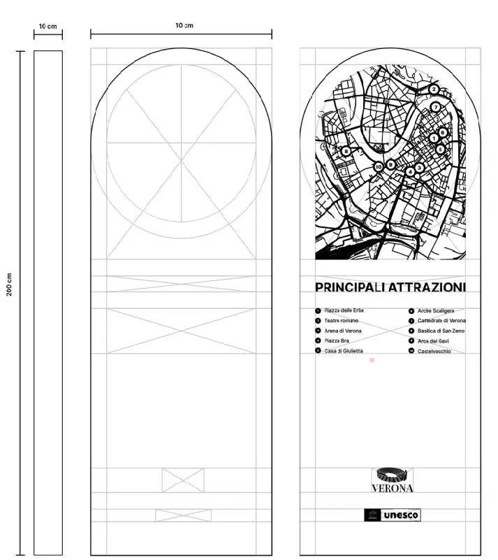
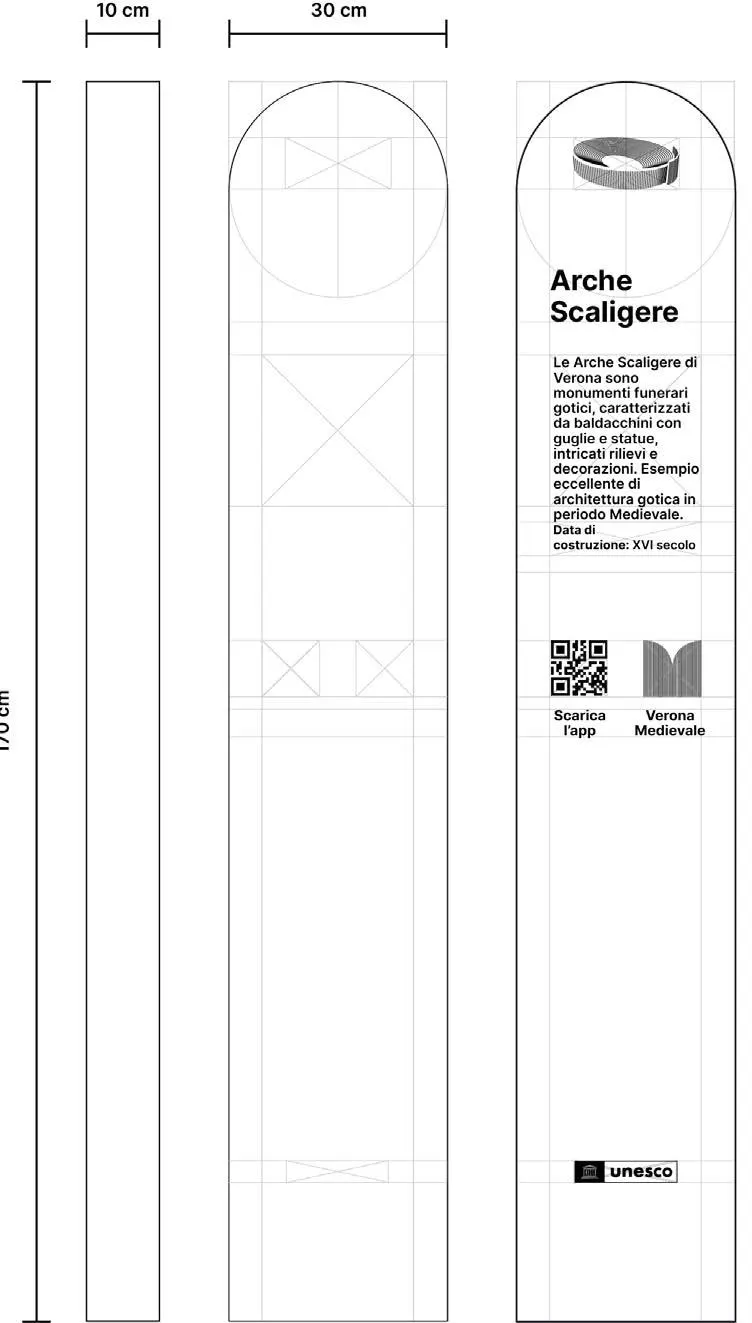
The wayfinding system transforms the physical experience of moving through Verona into a branded encounter. The system includes a starter totem for entry points, a monumental totem for major landmarks, and directional indicators throughout the city. Each element maintains the visual language of the identity while prioritising legibility and orientation for visitors navigating Verona's layered urban fabric.

Crimson directional signs in a crowded Verona square
31 Directional indicators, in Piazza delle Erbe.
A crimson starter totem in front of the Arena
32 Starter totem, at the Arena.
A crimson monumental totem beside the Arche Scaligere
33 Monumental totem, Arche Scaligere.
The three wayfinding elements side by side, with a human figure for scale
34 The family, at human scale.
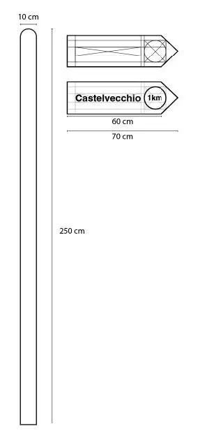
Technical drawing of a directional sign
35 Direction sign.
Technical drawing of the monumental totem with a city map
36 Monumental totem.
Technical drawing of the starter totem
37 Starter totem.
09

Social media

Verona in real time.
The social media plan runs on recurring formats that turn residents and visitors into contributors to the brand.

MonthlyEventsAn overview of what's on.
Weekly#LaMiaVeronaThe best photos submitted by visitors under the hashtag.
WeeklySapevi che?A slideshow of unknown facts about the city's monuments.
DailyStoriesBoth formats, in bite-sized content.
Instagram post on a phone: the Basilica di San Zeno
Instagram post on a phone: a vintage market
Instagram post on a phone: a monthly events overview
Instagram post on a phone: a detail of a sculpted façade
10

App

VeronApp. An alternative to the traditional city visit.

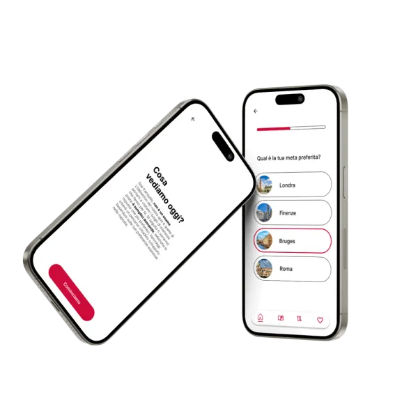
VeronApp guides tourists through personalised itineraries based on their interests, as well as standard routes designed to immerse visitors in the different historical periods that shaped Verona. A short quiz at onboarding profiles the user and generates a tailored experience. Detailed information on every heritage site is available throughout. The app transforms passive tourism into an active, personalised encounter with the city.
Two phones showing VeronApp: the onboarding quiz and its answer options
38 The onboarding quiz.

[ In the end ]

Together, the three colours convey Verona's richness and duality: past and present, stone and life.

← All work