- University
- Politecnico di Milano
- Year
- 2025
- Team
- 2 people
- Duration
- 12 weeks
Agosto, moglie mia non ti conosco
Visual book.
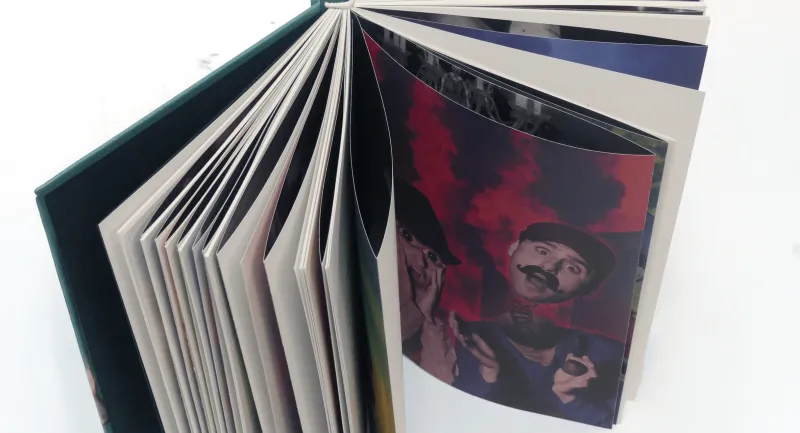
After Achille Campanile
17 × 21 cm · Munken White 90 g/m²
[ In one line ]
A visual book that retells Achille Campanile’s novel in pairs of images: one plausible, one absurd.
Brief
A novel, turned into images.
A visual book reinterpreting Agosto, moglie mia non ti conosco, by Achille Campanile, an Italian author known for his surreal and paradoxical humour.
The project translates the novel's double nature into images: the theatrical structure that drives its narrative, and the absurd humour that runs through it.
Book plot
The story, in brief.
Set in a light, surreal atmosphere, the novel follows a group of summer guests at a seaside guesthouse on the Gulf of Naples. Their quiet routine is shattered when a cruise ship sinks and its captain mistakes the life jackets for chastity belts, triggering a frantic, absurd chase for the keys that drags every character into increasingly bizarre situations.
There is no single protagonist: the novel unfolds like a stage play, with each character locked into a fixed, caricatural role.
Visual concept
A double register.
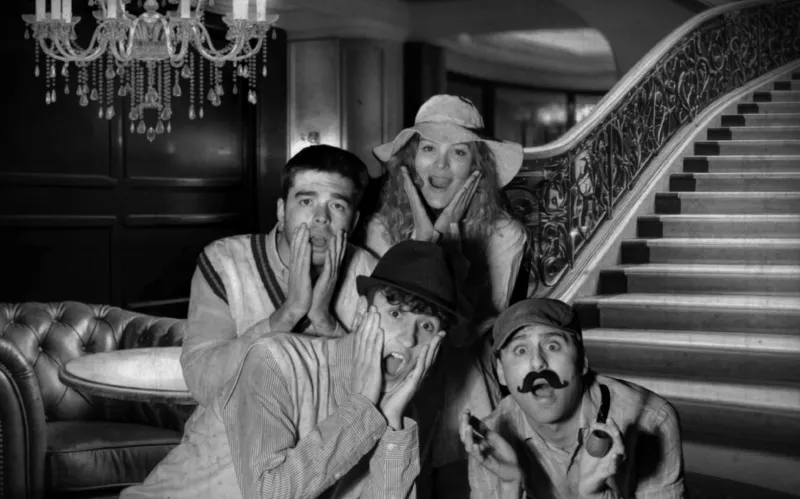
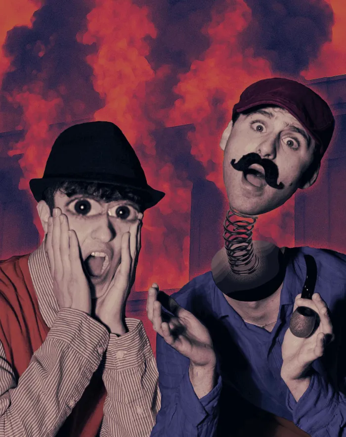
Each scene in the book is told through two complementary images.
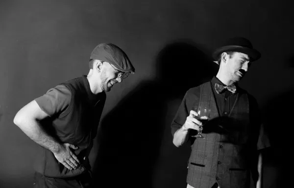
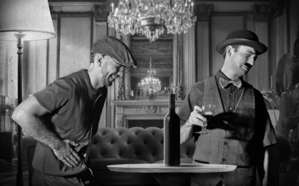
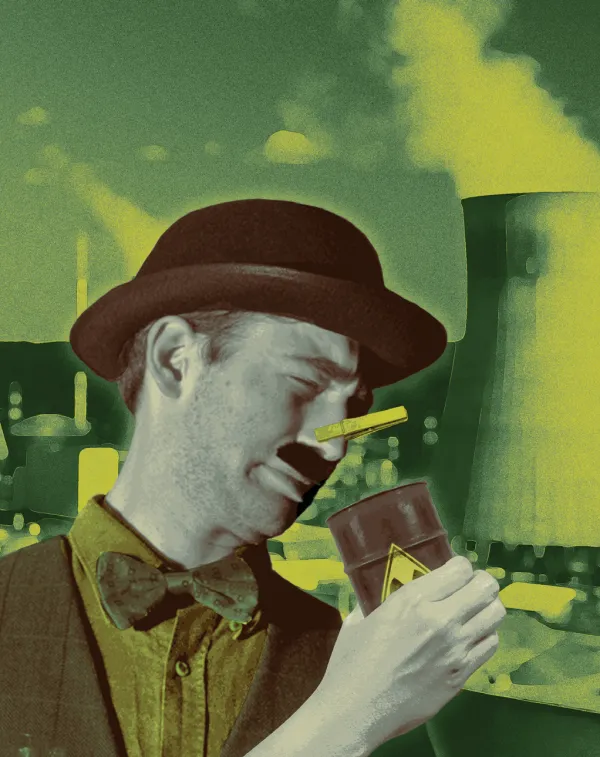
The two images are meant to be read together: what looks credible on one page is destabilised on the next. This shift between coherence and paradox mirrors exactly what happens in Campanile's writing, where logic is pushed to its edge until it dissolves into nonsense.
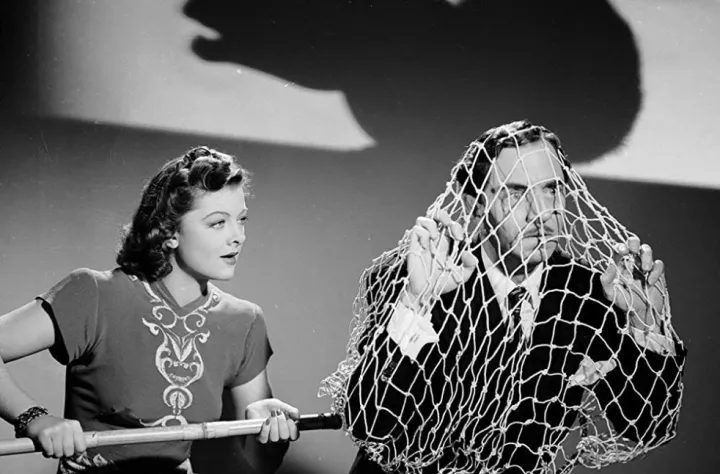
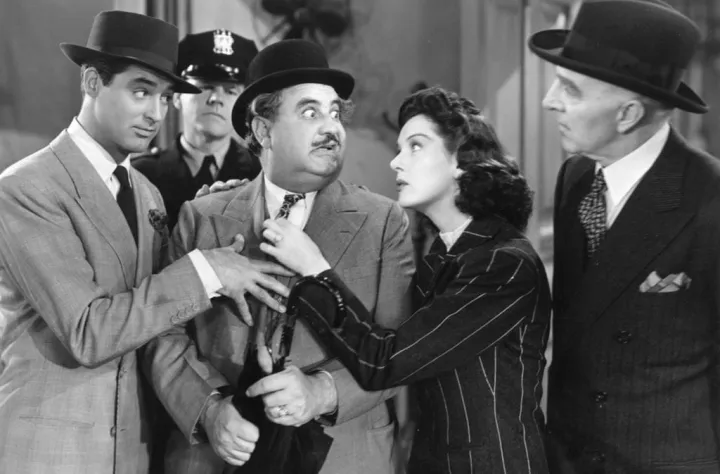
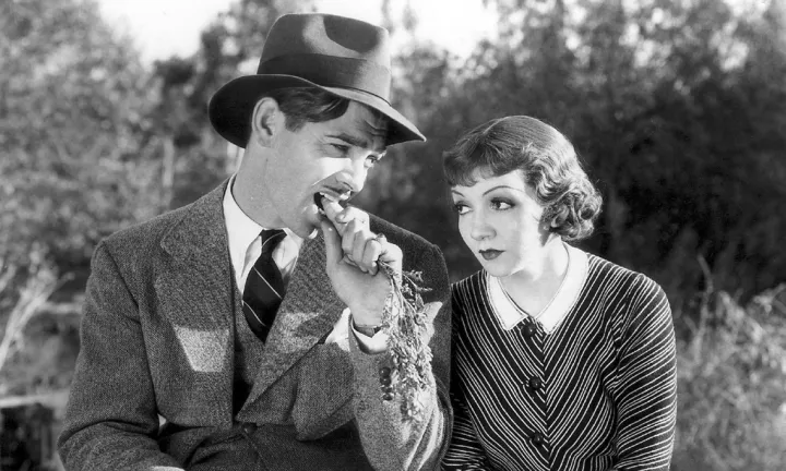
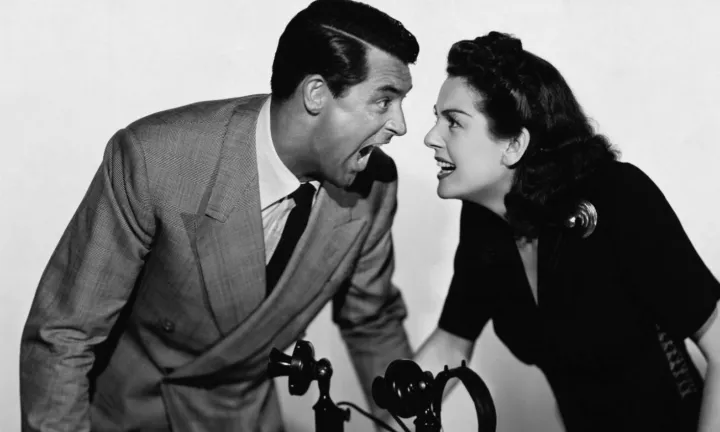
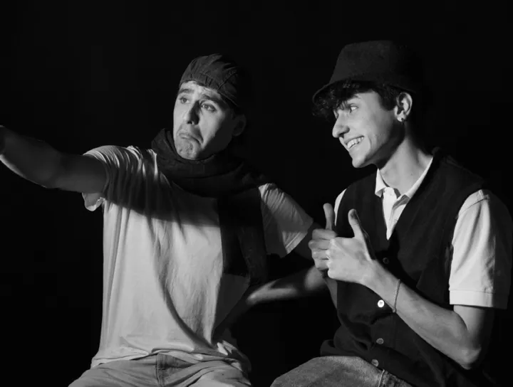
Visual references: black and white
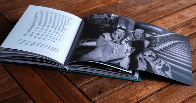
Screwball comedy shares Campanile's core mechanism: comedy built through role reversal, exaggerated behaviour staged within a tightly codified world.
Visual references: colour
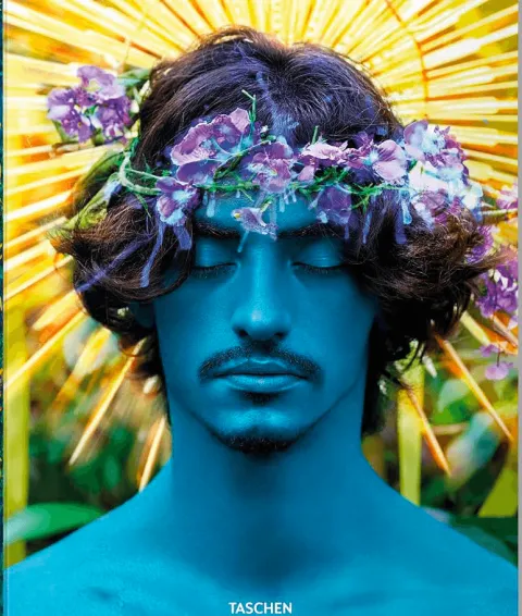
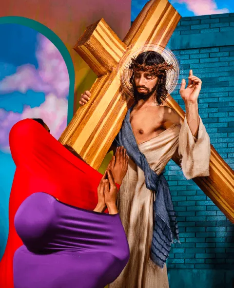
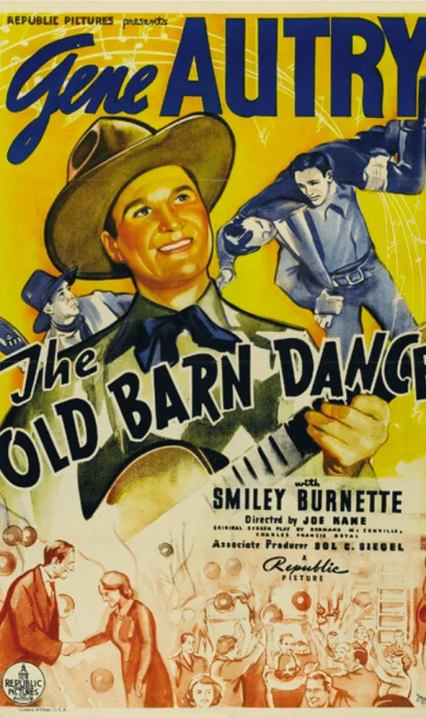
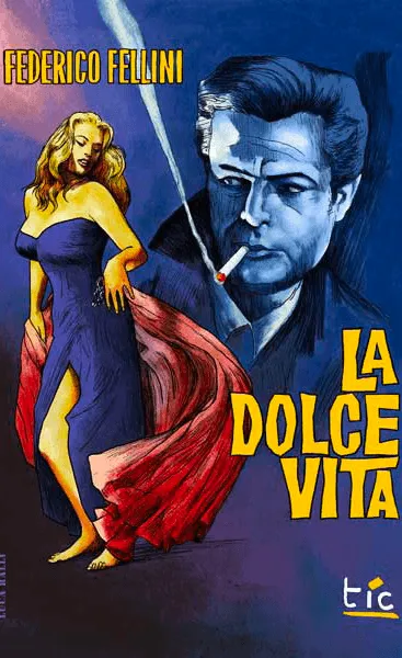
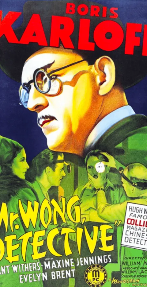
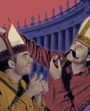
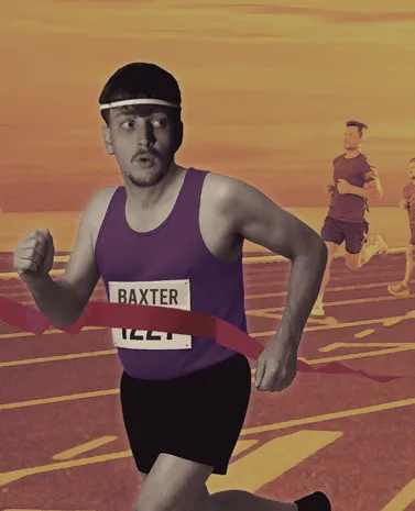
The colour photographs draw on two sources: the hyperreal, oversaturated set design of David LaChapelle, and the bold palette of 1930s–60s film posters: cobalt blue, vivid red, bright yellow, burnt orange.
Process
From first sketches to final images.
Early tests mixed stock photography, hand-drawn elements, and digital illustration, including a “paper theatre” look and an oversized-head caricature style. Both felt too far from the project's intent, so we returned to a more photographic, cinematic treatment: a real photo shoot composited with a digital background, finished with a vignette and light film grain.
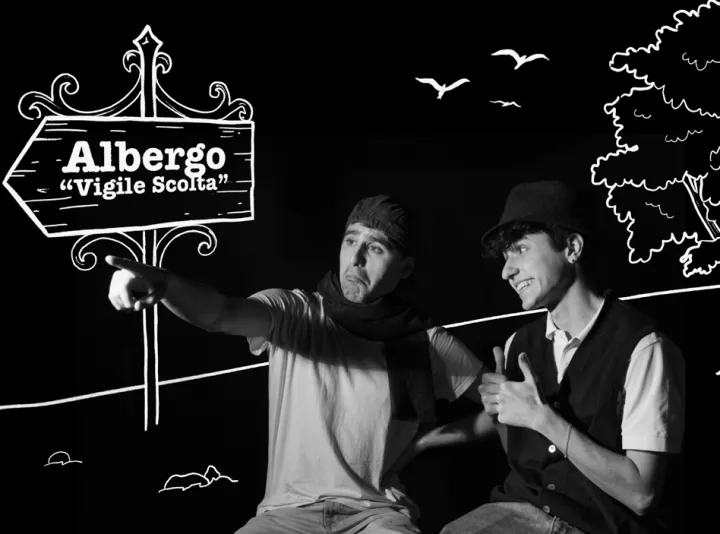
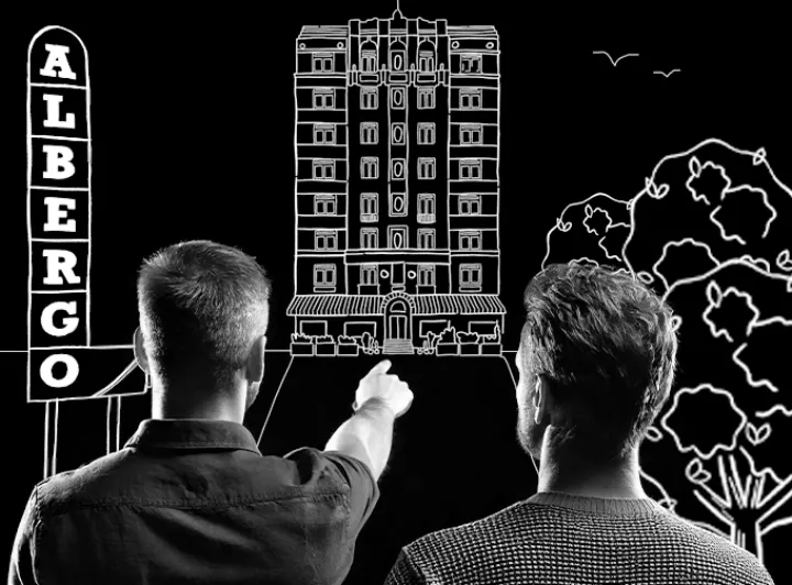
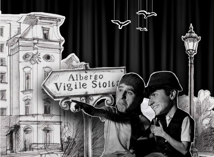
Processing the final images
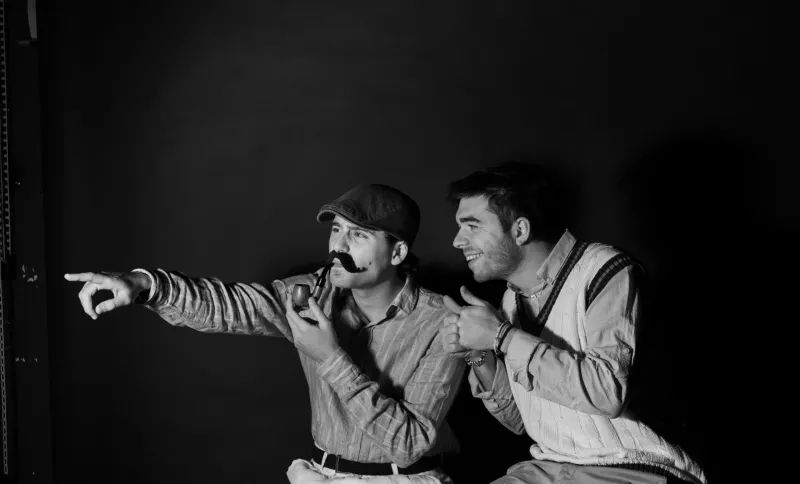
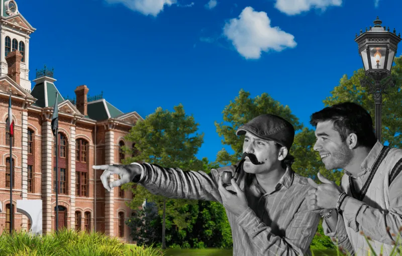
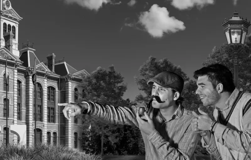
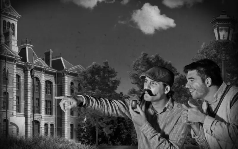
Final images
Every scene, twice.
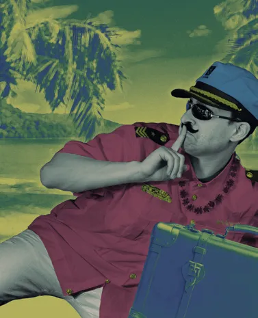
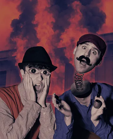
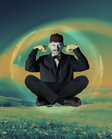
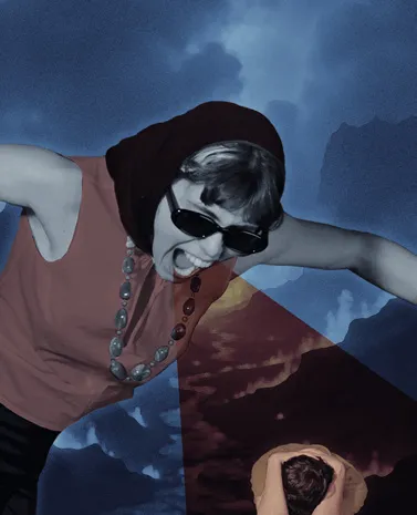
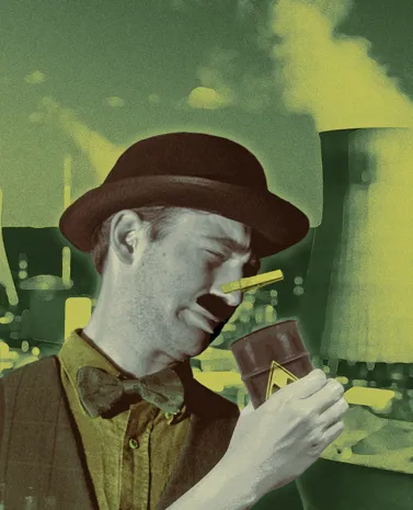
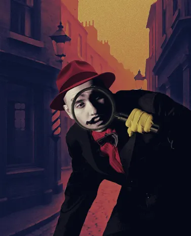
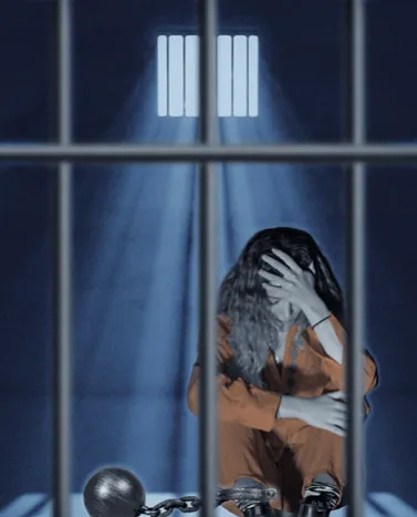
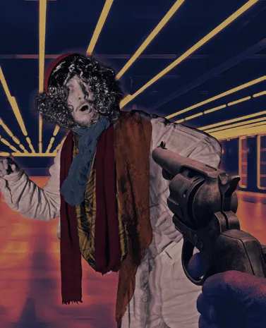
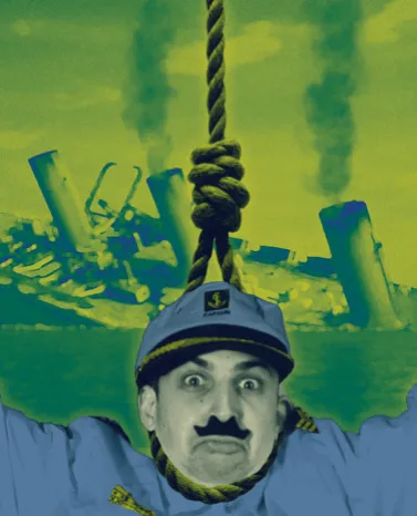
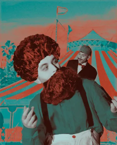
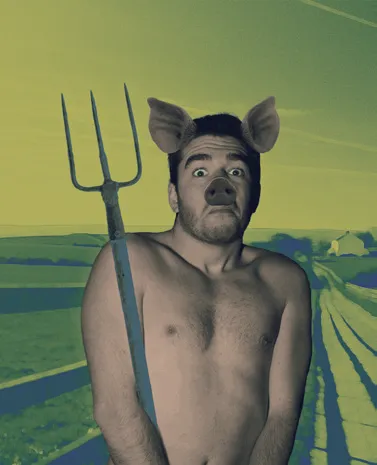
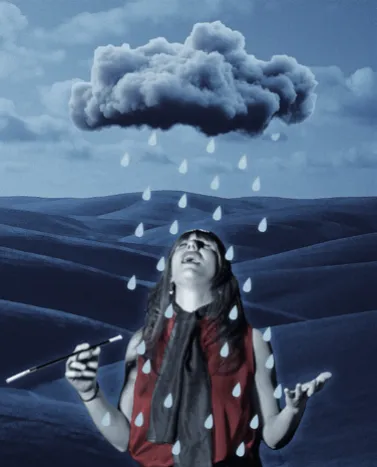
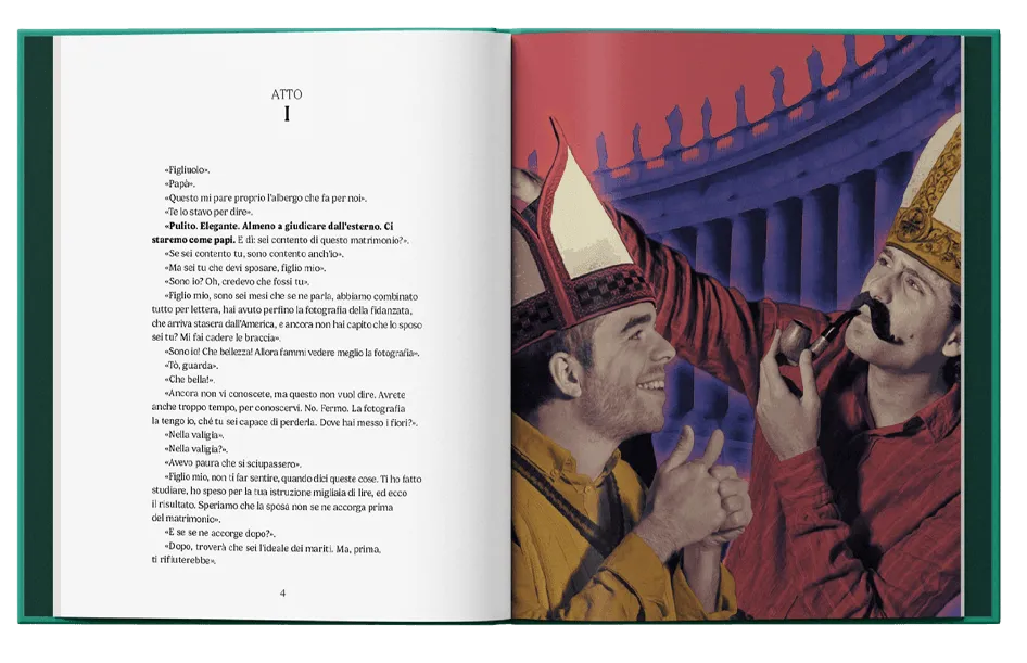
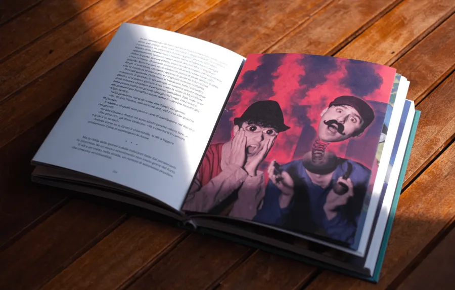
Each pair grounds a scene in plausibility, then pushes it into hyperbole: a dull cocktail becomes radioactive waste, an oversized head lands in a circus backdrop, a startled group is staged against flames.
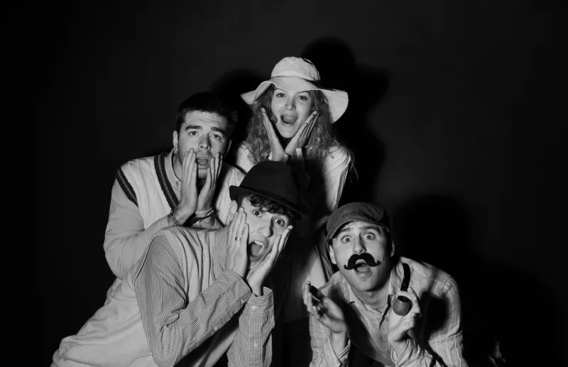
The fifteen colour plates

Materials and editorial details
Object book.
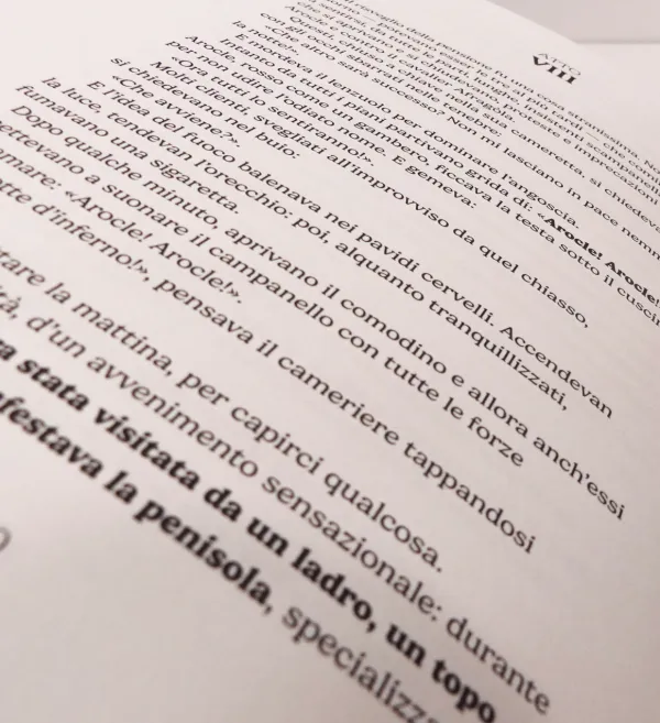
- 01Typeface. Gelica, soft, rounded, informal.
- 02Format. 17 × 21 cm.
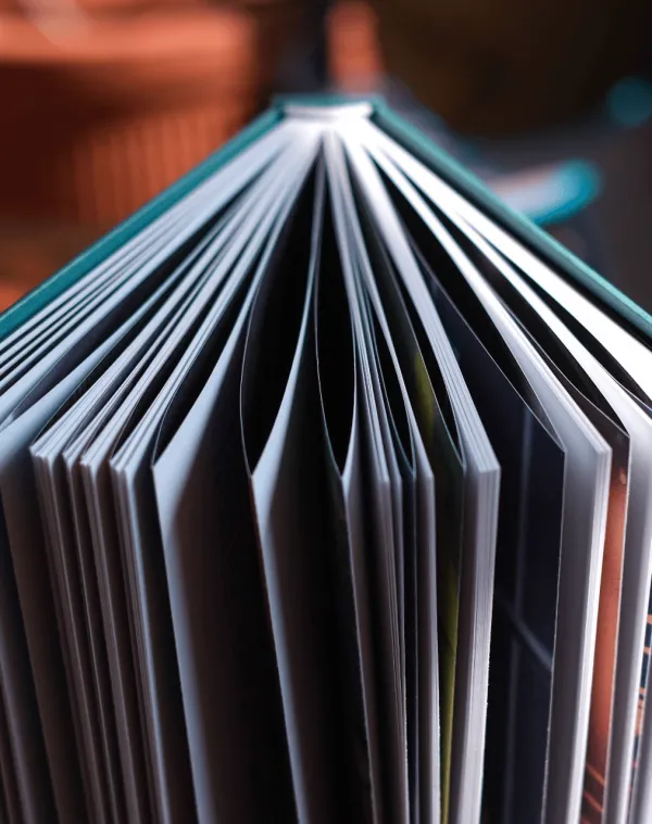
- 03Paper. Munken White, 90 g/m², warm and lightly textured.
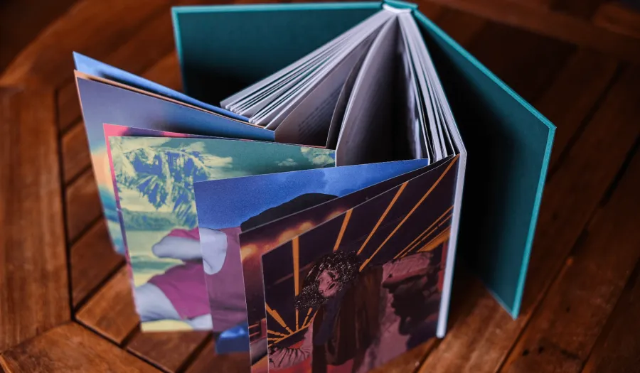
- 04Layout. Left-flag text; photos run as right-hand spreads in a “seagull wing” shape.
- 05Palette. Muted 1930s pastels.
The cover
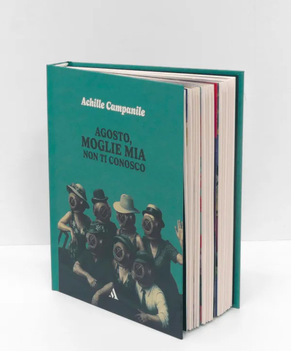
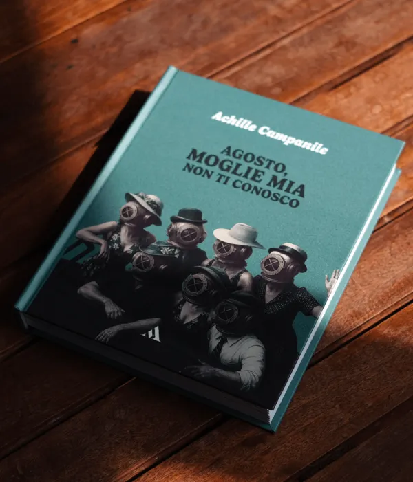
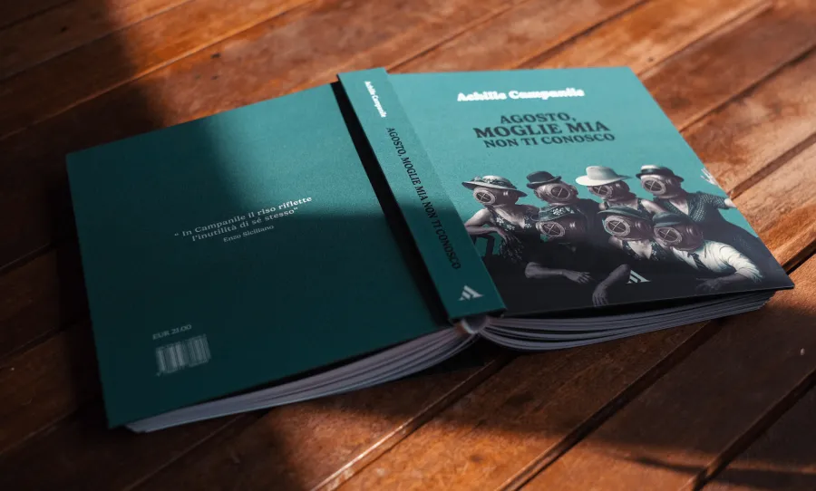
The characters crowd onto a boat wearing diving helmets over ordinary clothes, echoing the novel's life jackets / chastity belts, pushed into the absurd. Faceless figures reinforce the idea of characters as theatrical masks. The illustration is refined with a cyan tone evoking the maritime setting.
Gallery
Final book.
[ In the end ]
The colour image always distorts what the black-and-white one shows, visualising the tension between normality and paradox at the heart of Campanile's writing.